Red Gradient Side-Legend PBT Keycaps: Fit & Glow Guide
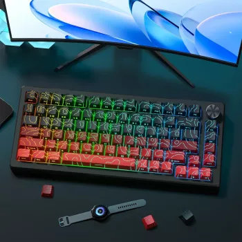
Red Gradient Side-Printed Shine-Through PBT Keycaps (Cherry Profile): What to Expect and How to Fit Them
A red gradient set with side-printed legends and shine-through compatibility changes both the look and the night-time usability of a mechanical keyboard. This guide breaks down material feel, profile ergonomics, lighting results, compatibility checkpoints, and practical setup tips to help you buy confidently and get a clean install on day one. For more guidance, see Side Print Pbt Cherry Black 136 Key ….
Design highlights: gradient color + side legends
Red gradients can look dramatic without feeling loud, especially when the shade transitions are consistent across rows. On darker cases (black, charcoal, deep navy), the lighter reds pop; on lighter cases (silver, white, frosted acrylic), the darker reds add contrast and keep the board from looking washed out. For further reading, see Cherry Mx Red Keycap 115 Keys Red Transparent Clear ….
Side-printed legends are the other defining feature. Instead of printing labels on the top surface, the legends sit on the front face—cleaner from an overhead view and still readable from a normal typing angle. If the goal is a minimalist “blank top” aesthetic without fully blank keycaps, side legends are a practical middle ground.
Because these legends are designed to be shine-through, they can glow with backlighting. The final effect depends on the keyboard’s LED placement and how the light interacts with the keycap’s plastic thickness and legend window design.
Material and feel: why PBT changes daily use
PBT is popular for everyday keyboards because it tends to keep its texture longer than many ABS sets. Where ABS can develop a smooth, glossy spot from finger oils over time, PBT is typically more resistant to that “shine,” helping the caps look newer for longer.
In use, many typists notice PBT feels drier and slightly more grippy. That extra traction can be helpful for fast typing or gaming, where fingertip control matters. Sound-wise, PBT often leans deeper or more muted, though the keyboard’s plate, foam, and case shape still play a major role in the final tone.
Cleaning is usually simple: warm water, mild soap, and a soft brush. Avoid harsh solvents, which can haze plastics or damage legend windows.
Cherry profile basics: comfort, height, and common tradeoffs
Cherry profile is a sculpted keycap profile with a relatively low height compared to many common OEM sets. That lower stance can reduce finger travel and feels comfortable for long sessions, especially if you rest your hands low on the desk or use a thin wrist rest.
Because Cherry profile is sculpted, each row is shaped differently (angle and height). Correct row placement matters: mixing rows can make the keyboard feel “off,” and it can also change the sound, since angle and thickness affect how keys bottom out.
One tradeoff to understand is potential interference on some builds, most commonly involving north-facing LEDs with certain switch and stem geometries. It doesn’t happen on every board, but it’s worth checking before committing—especially on compact layouts where you’re likely using RGB and want a consistent feel. For deeper switch background and terminology, Cherry’s MX documentation is a helpful reference: Cherry MX Key Switches – Technical Information.
Backlighting and shine-through: what affects brightness
Side-printed shine-through looks different from top-printed shine-through. Instead of glowing straight up at you, the light tends to “wash” across the front face of the keycap, making the legends most visible from a seated typing position. From directly above, the legends can look subtler—and that’s often the point for buyers who want a clean top view.
| Factor | What you may notice | Quick fix |
|---|---|---|
| LED position | Legends may appear brighter on the side closest to the LED | Adjust angle/brightness; consider switch orientation if possible |
| Keycap wall thickness | Thicker caps can reduce overall glow | Increase backlight intensity or use brighter LEDs |
| Legend window size | Small windows look subtle; larger windows pop more | Use a higher contrast backlight color (white/ice blue) |
| Case/plate reflections | Under-glow can tint or brighten the legends | Try a darker desk mat or reduce RGB saturation |
If you’re evaluating whether the gradient looks “true,” test with a clean white backlight first. Colored RGB can tint the red caps and make the gradient look warmer or darker than it is in neutral lighting. For profile visuals and comparisons across common sets, these guides are useful: KBDfans – Keycap profile guide and Ducky – Keycap profiles.
Compatibility checklist before buying
1) Switch stem support
2) Layout support
3) Stabilizers on large keys
4) Legend preferences
Installation and setup tips for a clean result
Product picks (in stock)
- Red Gradient Side-Printed Shine Through Keycaps Cherry Profile PBT ($46.51)
- Coding with Confidence in the Age of AI – Ultimate Digital Guide for Developers ($11.99)
Who this set fits best
FAQ
Will side-printed shine-through legends be readable in the dark?
They’re usually most readable from the normal typing angle, since the glow is directional on the keycap’s front face. Brightness depends heavily on LED position and your backlight intensity, and they can look subtler from directly overhead.
Do Cherry profile keycaps fit all mechanical keyboards?
They commonly fit keyboards that use MX-style cross stems, but layout support (right Shift, bottom row sizes) must match your board. Some builds can also experience interference with certain switch/LED orientations, so it’s smart to confirm your PCB and switch setup before buying.
How do PBT keycaps differ from ABS in long-term use?
PBT typically resists developing a glossy shine and tends to keep a drier texture over time, while ABS can polish smooth with heavy use. PBT can also sound a bit deeper depending on thickness and the keyboard’s case and plate acoustics.





Leave a comment